Case study
Monolot
Client: monolot
Year: 2020
- Strategy
- Naming
- Branding
- UX/UI design
- Web development
Naming, strategy, visual identity and web design for an ambitious 3D studio
The client
Monolot is a cutting-edge visualization studio creating hyperrealistic images with a unique minimalistic signature. Their breathtaking images of architecture are not only technically perfect but also work with a characteristic light setting and composition. Production of this studio is exceptional also thanks to the number of details they are able to incorporate in a single image. Together with architects they create forward-thinking visions of the future and tell stories around unbuilt architecture.
From the beginning of this project, we have been working closely with the client. Launching a new brand is always exciting, but it takes a lot of effort on both sides. During an intensive remote workshop, we understood the business model, target audience and nailed down the foundations of a new brand. Several interviews with existing clients were conducted to validate our thinking in terms of brand promise and the unique value proposition of the company. We developed the idea of archviz images as a beginning of stories of unbuilt architecture. Stories that continue with the construction of buildings and finally all people using them.
The objective
Complex projects can be rewarding and working with the three co-founders was one hell of a ride. They approached us to help them create a brand that would unite their individual activities under one roof. This group of 3D artists and managers had big ambitions: to be the best in their field not only locally, but globally. Their vision went far behind creating beautiful images of architecture – to provide a platform for education, networking and push the whole industry forward.
The solution
Together with the client, we developed differentiating strategy, naming, brand identity and a website. The new branding helped to kick-start the mission of monolot, attracted the world's most famous architects and grew their team rapidly. Our cooperation is an ongoing process pushing the brand and business forward continuously...
Naming
Based on the brand strategy we started thinking about a new name. This process took almost 3 months and was full of dead ends. The final name – monolot – was created by combining words of several meanings, which describe the essence of the studio's work and its focus on architectural visualizations. The similarity with the word "monolith", as well as the composition of the words "mono" - single/one and "a lot" - very (i.e. very simple), refers to the rational approach and minimalist atmosphere that is characteristic for the production of the studio.
Brand identity
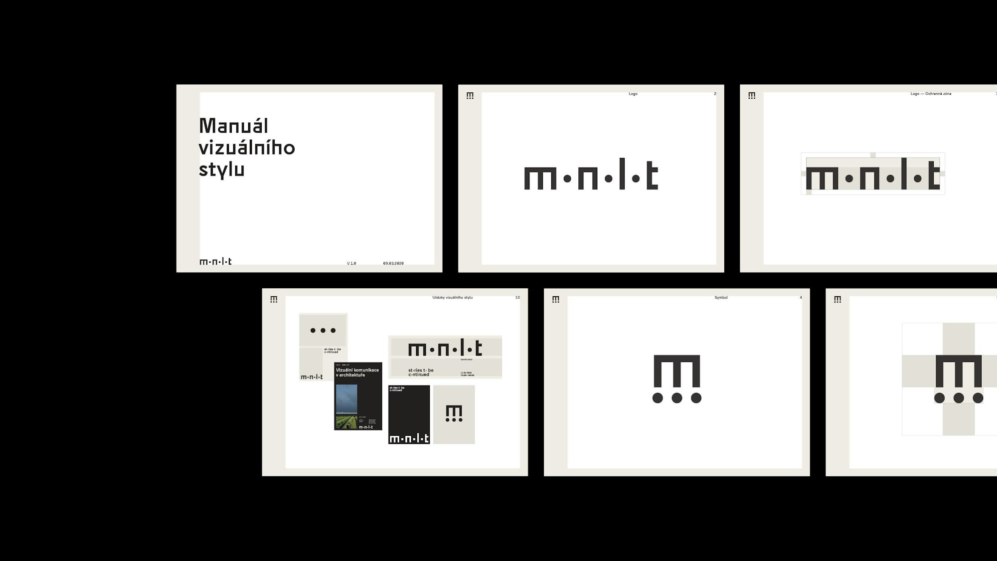
Based on the brand strategy and naming the aim was to create extremely minimalistic visuals to be aligned with the character of the images and don’t compete with them. A limited color palette, raw typography, and all design elements had to be stripped down to achieve this feeling.
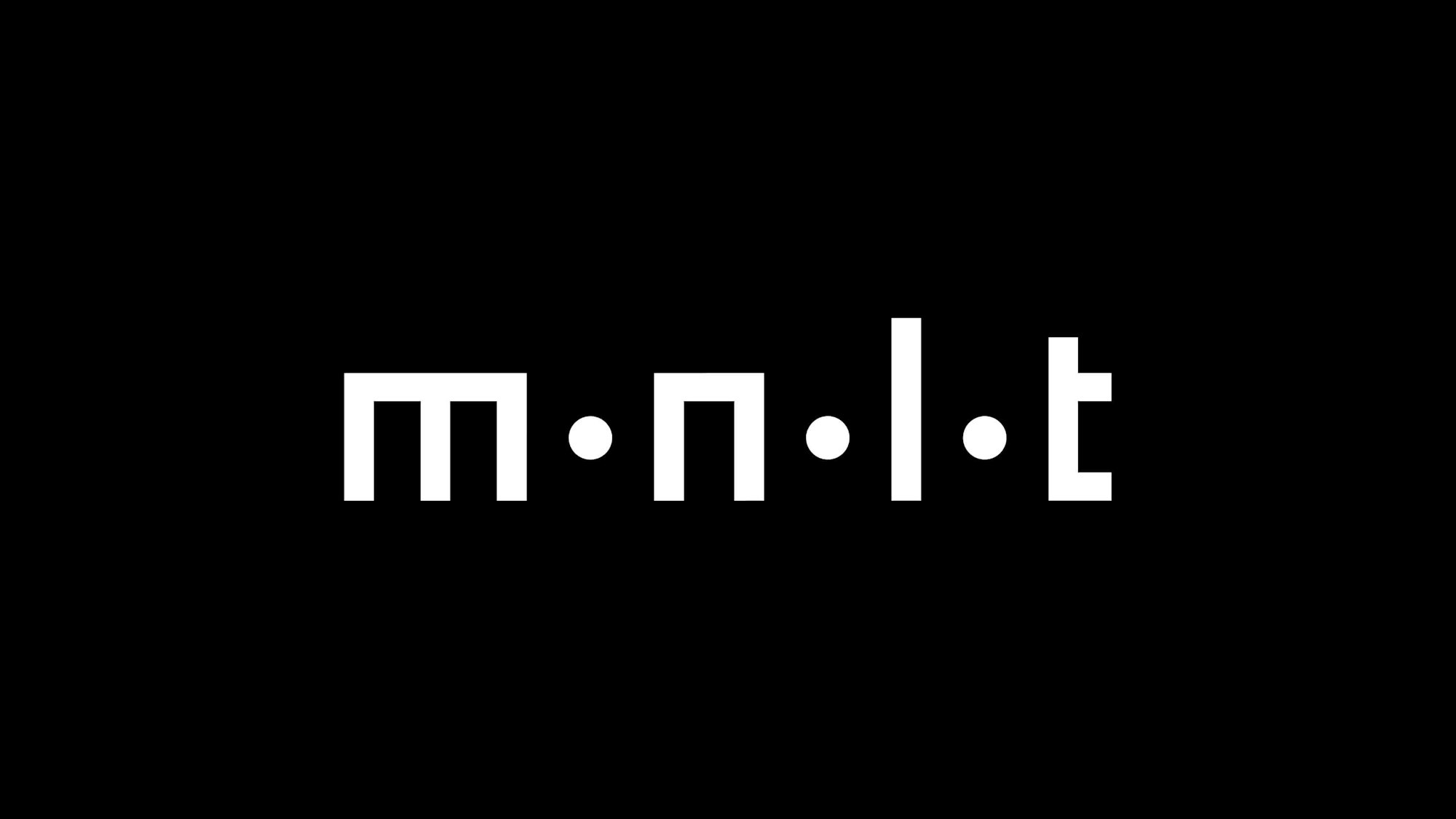
The logo itself is composed of basic building blocks – similar to those that can be found in architecture. Three o’s are replaced with dots, that when put together create an ellipsis (...). It is commonly used in written language to omit part of messages and therefore communicate their images as stories to be continued…
Website
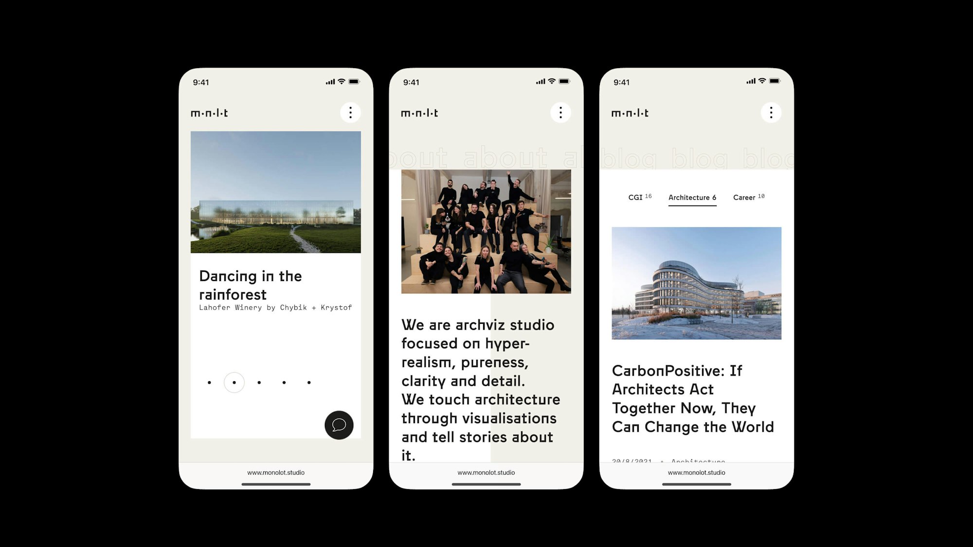
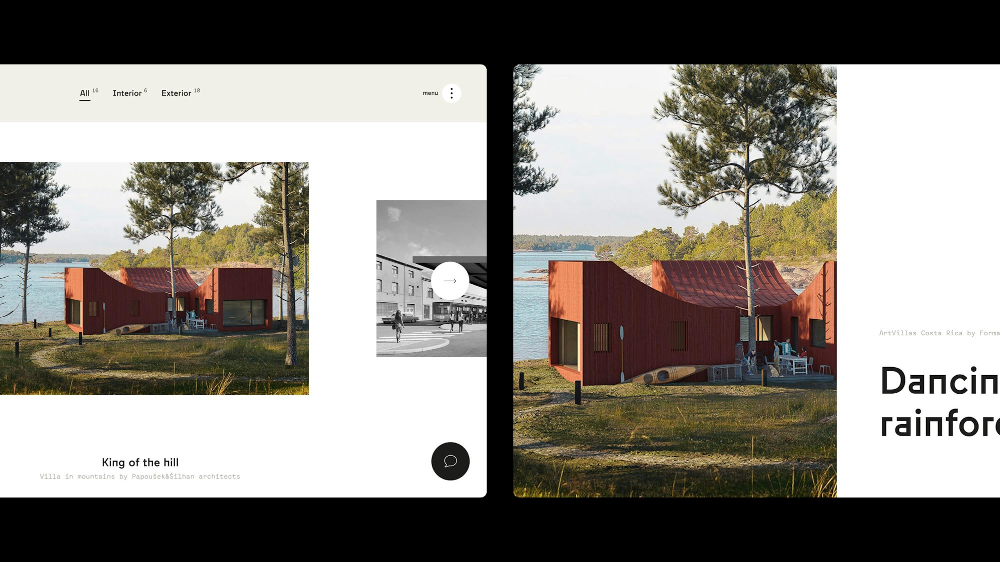
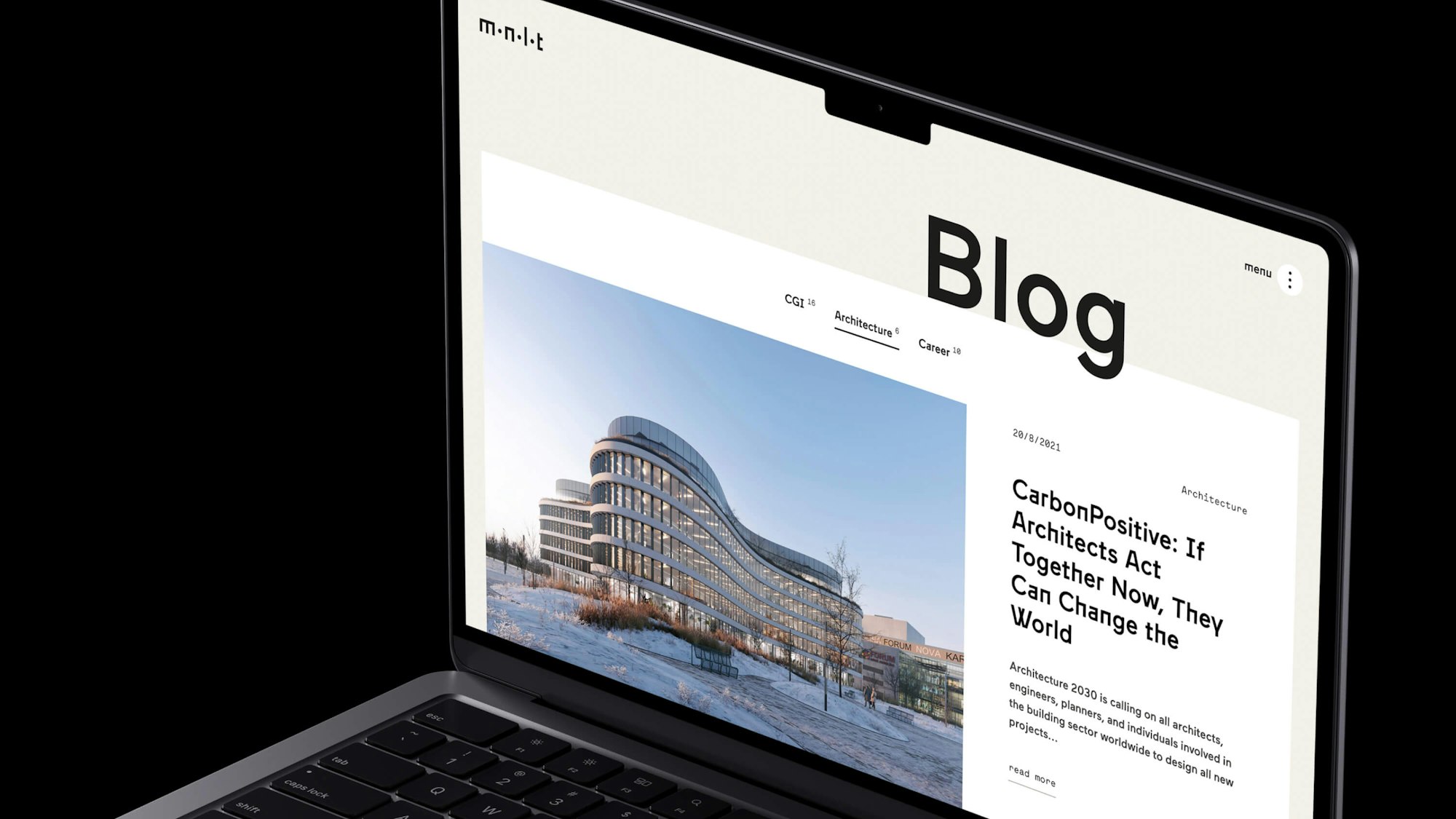
Website is a crucial part of the whole project because of the global ambitions. To support the brand strategy and create a memorable experience we decided to divide the website into chapters and employ horizontal scrolling together with some advanced interactions.
The team
Strategy, Branding, UX/UI Design: Ondřej Jelínek
Naming: Ondřej Jelínek, Anna Pavlíčková, Matěj Černý
Copywriting: Matěj Černý
Web Development: Matouš Barnat
